
Project 2 – Combine ONE Letter + ONE Number
OVERVIEW
Create three different designs based on combining ONE letter with ONE number using these design principles:
Design 1: Scale (Difference or Equal)
Design 2: Positive/Negative
Design 3: Style Contrast
In this project you’ll explore the visual relationships between a letter and a number. You will use 3 different design principles in the process of combining 2 glyphs together. Discover similarities in form and make visual connections that are appealing and engaging. Look for shared aspects such as similar strokes, angles and shapes. Look for edges and shapes that can be shared by both forms.
NOTE: Form refers to both a letter form and a number form throughout this brief.
GuidelineS
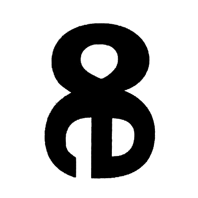
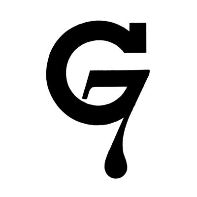
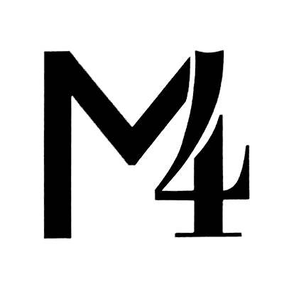
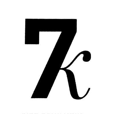
Parts of one form are allowed to blend into or completely replace parts of the other form. But just randomly sticking two forms side-by-side or on top of one another IS NOT ENOUGH. They must share similar traits and combine in such a way that draws attention to those aspects of the forms. Each form in the design should have relatively equal importance in how they are composed. This means that one form should not completely disappear in service of the design. A viewer should be able to correctly determine which letter is combined with which number. (ex: A7, B6, C3)

The Font List
01. Alegreya
02. Avenir Next
03. Baskerville
04. Bodoni 72
05. Caslon
06. Didot
07. DIN Next
08. Franklin Gothic
09. Fira Sans
10. Futura
11. Garamond
12. Gill Sans
13. Helvetica Neue
14. Hoefler Text
15. Knockout
16. Palatino
17. Rockwell
18. Sentinel
19. Source Sans
20. Times
Goals of the Project
It’s important that you draw the letters by hand. This helps you become familiar with the tiny differences in each type style. DO NOT ATTEMPT TO DRAW COMBINED FORMS ON A COMPUTER.
Exploration is a vital part of all design projects. That is why you need to create more than one design. Give yourself lots of ideas to choose from.
Don’t try to come up with THE ONE perfect solution at the beginning. Designers know that even the best idea will change and improve throughout the design process.
Concerning your final grade: the amount of exploration, change and revision is more important than creating the perfect design instantly at the beginning.
Specifications
Create compositions using only type that demonstrate the three design principles outlined in this brief. In each composition, you will use only one letter and one number. Work only in black and white, no shades of gray. You’ll follow the same design and production process steps from the first project.
Work only with the 20 font families listed below. Period. No Papyrus, no Comic Sans. However, you may explore the full range of weights and styles that are available (i.e. Didot Italic, Rockwell Bold Condensed, etc.).
There are a few letters and numbers are banned from use for this project. They are:
numbers: 1 (one) & 0 (zero)
letters: iI, jJ, lL, oO, vV, xX, yY, zZ
Based on previous experiences, these glyphs have proven difficult to use in service of creating distinctive designs. DO NOT USE these glyphs in your designs.
Tips for Success
A project Specification Checklist PDF is linked to the image below. Use this to make sure you are following all of the instructions correctly before you turn in your project folder!

Using Design Principles
When working with type, designers use design principles to express different ideas. In this project you will make compositions using these three design principles:
Scale
You may choose to demonstrate a difference in scale or show the scale of both forms as equal. Demonstrate a SCALE DIFFERENCE by using one character at least 50% larger or smaller than the other one.
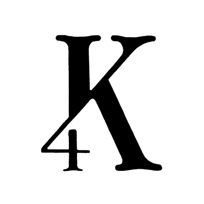
Demonstrate EQUAL SCALE by keeping each character approximately the same size.


Positive/Negative
One character is the negative form. The other is the positive form.


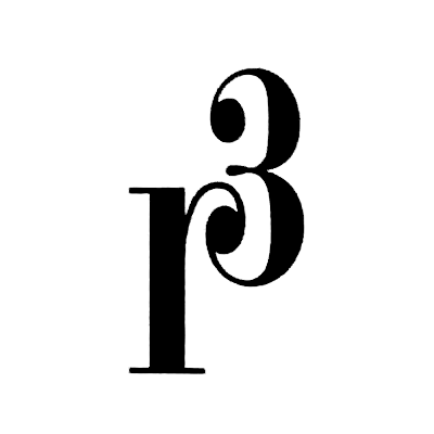
Style Contrast
Choose characters that have distinctly different styles. Combine them to work together as one design. Examples of contrasting style combinations are: italic/roman, transitional serif/san serif, bold/thin, modern serif/san serif, etc. Combine the contrasting forms so that they make one harmonious design.
Thumbs
Thumbnail Design Phase
Develop thumbnail sketches on tracing paper. Thumbnails are 1¾" x 1¾" in size. Trace the letters with pencil or a fine tipped black marker (not ball point). Part of your grade is based on your thumbnails, so don’t cut corners here. Do not modify letters unless you are blending or replacing elements with the other form. Your instructor must approve any alterations.
Use separate sheets of tracing paper for each design principle (minimum 3 sheets total).
Trace the letter forms. Print out letter at various sizes to the black/white printer in CT109.
Create NO LESS THAN 5 thumbnails for each design principle (minimum 15 total thumbnails).
It is important to fill in the characters with solid black to see volume and shape. Fill in all outlines.
Expect to do several variations before you find a good solution.
Cut out your five strongest thumbnails in each category and mount them on three horizontal sheets of 8½" x 11" cardstock white paper. Match the layout of this template.
The five thumbnails per page you turn in should be inked for clarity. Do not leave as pencil sketches.
5 each x 3 design principles = 15 thumbnails.
Roughs
Tight Rough Design Phase
Do further refinements of the selected two thumbnails for each design principle. You must redraw the designs with greater detail. Tight roughs must be inked with solid black markers. Trim out your 2 strongest tight roughs in each category and mount them on three horizontal sheets of 8½" x 11" cardstock white paper. Match the layout of this template.
2 each x 3 design principles = 6 tight roughs.
During the tight rough critique you’ll choose the best design for each concept and create a final, tight comp.
Final Comps
Final Design Phase
Your final designs should be inked at an 8" x 8" size on vellum or high quality tracing paper. Make trim marks showing where to cut. Leave a minimum 1.5” margin on all sides. Designs should be centered with equal spacing top-to-bottom and equal spacing left-to-right. There will be no bleed for these designs. Reduce your inked artwork down 75% on the photocopier to make the final 6"x6" size. The reduction will minimize flaws and create clean, sharp edges. Make 2 copies at this final size. One copy you will turn in to be used as my grading Markup Copy. For the second copy, use adhesive (Artist Tack) to mount it to a piece of cardstock (thicker paper). Trim out final work at 6" x 6" size.
3 design principles = 3 final comps.
Explain Your Design
For this project there is one additional step that you will do in the Final Design Phase, which is to explain your design using type terminology.
You need to explain the visual relationships in your designs by writing sentences on a photocopy of the final designs. Use typographic terms and refer to the correct type anatomy when describing your designs. Below is an example of how this might look.
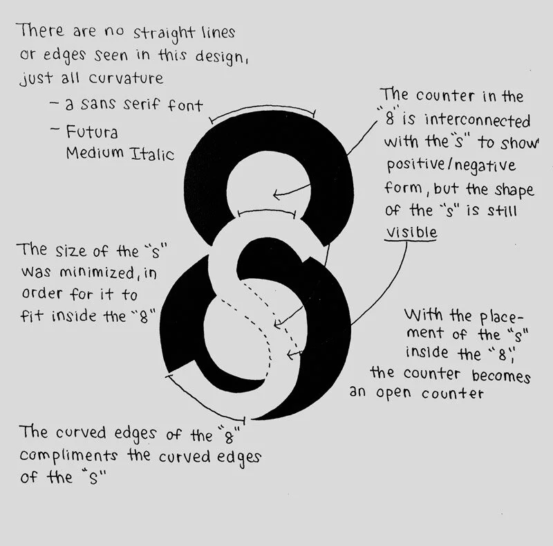
It’s quite possible that your design could simultaneously represent more than one design principle. This example design demonstrates both Positive/Negative and Style Contrast design principles.